F-Pattern: Web Design For the Human Eye
Mar 26, 2016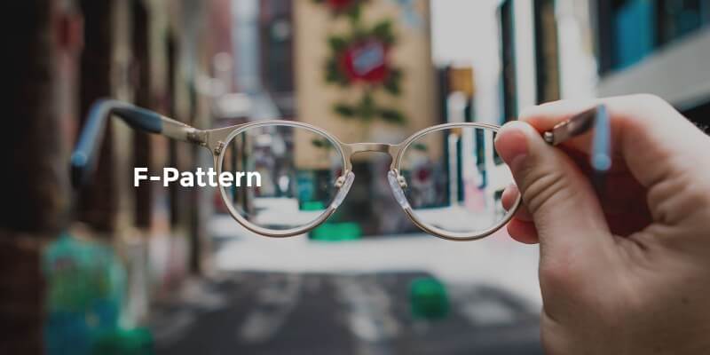
Web design isn’t all about pretty colors and fancy images. Believe it or not, we use a little science in our design techniques. What’s so scientific about design, you ask?
Enter F-patterns.
The “F” layout is a type of web design used to cater towards the natural reading instinct of most people. When reading, a person’s eye typically starts in the top lefthand corner of a page. They’ll scan the page horizontally, reaching the top right corner, before returning their eyes to the next line on the left side of the page. The second line they scan usually will not reach all the way to the right, as the user is now beginning to “skim” the page.
As they continue to scan the page, they no longer move their eyes horizontally and instead they skim straight down the left side of the page. This is what forms the f-pattern.
The F-pattern was initially discovered by the Nielson Norman group in an eye tracking study.
In the study, 232 users were recorded looking through thousands of web pages and it was found that their primary reading pattern was in the shape of an F.
Another study found users spending 69% of their browsing time on the left hand side of the page and 30% viewing the right, further reinforcing the habit of F-pattern viewing.
Okay, Enough Science. What can it do for me?
By understanding the way users read, you can “hook” them into the content easier.
In simple terms:
- People aren’t interested in reading every word. Unless you’re telling a tale worthy of a bestselling novel, be prepared for readers to skim through your content.
- Your important content goes up top. Studies show that users spend 80% of their time looking at information above the fold. As the top lines receive the most viewing, your content hooks should start there.
- Utilize organized bullets and lists on the left. Lesser content can be lined down the left with an emphasis on catching the user's attention as they skim downwards.
When creating a page using this layout, it’s important to keep in mind the habit of someone who skims through content and place key information in important spots.
The F-shaped pattern for reading web content works very well in design, and science proves it. It’s certainly not a coincidence that many big name brands implement this style across their pages.
It’s Not Infallible
F-pattern pages do come with a small disadvantage. People are used to reading left to right, top to bottom. If we look at an unfamiliar text, that is the way we expect it to look. The same kind of inherent expectation applies to websites. While people like familiarity, overly static conformity to f-patterns will make the page feel too rigid and forced or boring to the one looking at it.
This can be combatted by lightly shaking up the layout with an image stretching across the page, or an advert that breaks up the rigidity.
Choosing a layout takes a bit of sensitivity and know-how to find just the right level of design that makes a viewer comfortable while looking at the page all without boring them away from the site.
Should You Use It?
If you are looking to improve an existing website, or build a new one, giving this layout a thought is well worth it. Whether or not this layout will work on your site depends on the type of content you have to offer and your users viewing patterns. The f-pattern is not the only kind of layout in web design. Others include the Z-pattern or Gutenberg diagram. Each has its own strength and weaknesses that should be weighed out before implementation.
Strategizing your web design is one of the first steps in creating an engaging site with high conversion rates.
UKIE WEB is a web development company that uses advanced art techniques and science-proven designs to craft beautiful sites that our clients and their audience love.